TYPE 4 THOUGHT
Microsoft, Core fonts for the web (1996)
Core Fonts Sample

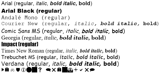
Sample of Microsoft’s core fonts for the web, released in 1996, rendered on Internet Explorer on Windows 7.
https://en.wikipedia.org/wiki/Core_fonts_for_the_Web
See More > Digital technology > Internet > Desktop publishing > Digital typography > Default systems > Standardization > Microsoft Windows > Freeware > Typefaces > Monotype Corporation > Arial > Andalé Mono > Courier New > Comic Sans MS > Georgia > Impact > Times New Roman > Trebuchet MS > Verdana > Wingdings > Legibility > Accessibility

Jesse England, The oldest printer made with one of the newest printers (2016)


Laser cutter, 1/8" Birch wood
http://www.jesseengland.net/project/addressable-text-rubbing-device/
See More > Means of production > Printing > Analog > Typography > Typographic history > Typographic technology > Moveable Type > Typefaces > Arial > Typesetting > Translation > Digital/Analog > Digital Conversion

Comparison of printed and digital versions of Perpetua
Core Fonts Sample

The top line is a printed sample of the Perpetua typeface, taken from On Type Designs Past and Present by Stanley Morison (London: Ernest Benn, 1962), p. 79. The bottom line is a digital sample of Perpetua generated using GIMP software.
https://commons.wikimedia.org/wiki/File:Comparison_of
_printed_and_digital_versions_of_Perpetua.png
See more > Means of production > Printing > Analog >Typography > Typographic history > Typographic technology > Letterpress > Fonts > Perpetua > Typesetting > Digital typography > Digital Conversion > Standardization > Visualization > Translation > Digital/Analog

The Monotype Archives, Stylized original drawing of Times New Roman M
Core Fonts Sample

In 1931, The Times of London newspaper commissioned Monotype to create a new serifed typeface, Times Roman.
https://www.linkedin.com/pulse/thirty-years-monotypes-times-new-roman-arial-windows-greg-hitchcock/
See More > Means of production > Printing > Analog > Typography > Typographic history > Master Drawing > Typographic technology > Typefaces > Times New Roman > Letterform > Archival > Visualization > Standardization

Dinamo Typefaces, Side-by-side comparison of Arial and Areal, a font designed for Are.na (2025)
Core Fonts Sample

Side-by-side comparison of the outlined bezier paths of Arial and Areal by Dinamo Typefaces.
https://www.are.na/editorial/introducing-areal-are-nas-new-typeface
See more > Digital technology > Desktop publishing > Digital typography > Bezier curve > Means of production > Printing > Analog > Typography > Typographic history > Master Drawing > Typographic technology > Typefaces > Times New Roman > Visualization > Standardization

@Litttle.einstein on TikTok, Untitled Video (2025)
Core Fonts Sample

Untitled TikTok video of @Litttle.einstein replying to a comment from @archandcrafts.
https://www.tiktok.com/@litttle.einstein/video/7464336250653248799
See more > Typography > Fonts > Comic Sans MS > Translation > Replica > Memory > Hand Lettering > Freehand > Popular culture > Virality > Means of production > Standardization

George Ryan, ITC Kristen (1996)
Core Fonts Sample

Inspired by a hastily handwritten restaurant menu.
http://www.identifont.com/show?3EM
See more > Digital technology > Desktop publishing > Typography > Typeface > ITC Kristen > Digital Typography > International Typeface Corporation > TrueType > Microsoft > Connotation

Richard Bradley, ITC Bradley Hand (1996)
Core Fonts Sample

Based on the designer's handwriting, using a plain felt-tip pen on a basic calligraphic pad.
http://www.identifont.com/similar?1V4
See more > Digital technology > Desktop publishing > Typography > Typeface > ITC Bradley Hand > Digital typography > International Typeface Corporation > TrueType > Microsoft > Hand lettering > Connotation

The Retail Display Blog, 5 Typefaces You Should Never Use on Signs (2011)
Core Fonts Sample

Papyrus, Curlz MT, Arial and Times New Roman, Comic Sans, and Bradley Hand (or any other "hand" fonts).
https://slimline-warehouse.blogspot.com/2011/06/5-typefaces-you-should-never-use-on.html
See more > Digital technology > Desktop publishing > Typography > Typeface > Arial > Bradley Hand > Comic Sans > Curlz MT > Papyrus > Times New Roman > Accessibility > Commercial design > Signage > Connotation > Typeface usage > Standardization > Control

John Gambell, Typesetting Checklist
Core Fonts Sample

A widely referenced list of typography rules used for book and print design.
https://www.dropbox.com/scl/fi/xvcytseujuyxhlwjkbh8w/JohnGambell
_TypesettingChecklist.pdf?rlkey=0lsw8yci3zpcv2acg8qmzxzxf&e=2&dl=0
See more > Typesetting > Standardization > Typography > Typographic systems > Typographic history > Typographic technology > Fonts > Legibility > Perfection > Control > Logics of Success
 THOUGHT 4 TYPE
Marcin Wichary, The hardest working font in Manhattan (2022)
Core Fonts Sample

Gorton, a monoline font made from a router-based technology dots various signage, elevator buttons, utility panels, plaques, and more throughout New York City.
https://aresluna.org/the-hardest-working-font-in-manhattan/
See more > Means of production > Printing > Analog > Pantograph > Engraving > Typography > Typographic technology > Typographic history > Typeface > Gorton > Monoline > Archival > Dissemination
Allison Meier, Recording the Fading Local Typography of Our Cities (2015)
Core Fonts Sample

A ghost sign and new parking signs in New York City.
https://hyperallergic.com/211670/recording-the-fading-local-typography-of-our-cities/
See more > Typography > Typeface usage > Typographic history > Typographic narrative > Legibility > Accessibility > Appropriation > Commercial design > Signage > Representation > Vernacular > Homogenization
@cool_lookin_bug on Instagram, I’m case u guys missed part 2 on the @adobe IG and TikTok. Thank you all for the love on this series (: #art #design (2025)
Core Fonts Sample

User @cool_lookin_bug on Instagram redesigns a simple street flyer for a local service, using Adobe Illustrator to reimagine the visuals. But is it necessary?
https://www.instagram.com/reel/CqqU3qst8z2/
See more > Digital technology > Desktop publishing > Digital typography > Default systems > Printing > Microsoft Windows >Typography > Typeface > Calibri > Popular culture > Virality > Content > Advertisement > Translation > Vernacular > Homogenization
Kyle Rath, The illusive type: Hunting typographic simulacra (2023)
Core Fonts Sample

Examples of Comic Sans used in various applications.
https://dl.designresearchsociety.org/cgi/viewcontent.cgi?article=1590&context=nordes
See more > Typography > Typeface > Cooper Black > Comic Sans MS > Chop Suey > Typographic history > Typographic narrative > Connotation > Typeface usage > Dissemination > Perception > Simulacra > Translation > Accessibility > Post-modernism > Criticality
Paul Sollelis, What is queer typography? (2024)
Core Fonts Sample

Paul Sollelis discusses the term queer typography, citing key figures, literature, and movements in history and notes various designers actively practicing in the search of exploring this terminology.
https://soulellis.com/wiqt/
See more > Means of production > Printing > Analog > Letraset > Letterpress > Phototype > Desktop publishing > Independent publishing > Digital technology > Typography > Typographic history > Typeface usage > Typographic narrative > Legibility > Queerness > Representation > Appropriation > Accessibility > Criticality > Subversion > Post-modernism > Post-colonialism > Vernacular
Dan Rhatigan, Hot type in the cold type era (2019)
Core Fonts Sample

Digitally rendered Letraset typographic specimen of Drummer magazine, an underground queer publication.
https://hottype.club/2019/08/13/hot-type-in-the-cold-type-era/
See more > Typography > Typographic history > Typographic narrative > Connotation > Typeface usage > Subversion > Means of production > Printing > Analog > Letraset > Pasteup > Illustration > Independent Publishing > Queerness > Representation
Dennis Grauel, A type manifesto (2022)
Core Fonts Sample

Dennis Grauel's manifesto noting the various sociopolitical implications of typography.
https://dennisgrauel.com/type-manifesto
See more > Typography > Typographic history > Typographic narrative > Connotation > Means of production > Dissemination > Perception > Accessibility > Control > Post-modernism > Post-colonialism > Logics of success > Criticality > Subversion > Representation
James C. Scott, Excerpt from Seeing Like a State: How Certain Schemes to Improve the Human Condition Have Failed (1998)
Core Fonts Sample

What defines legibility in typography? What are the consequences of problematizing this model of surveillance? Paul Sollelis proposes these questions in his essay, What is Queer Typography?
https://monoskop.org/images/9/9b/Scott_James_C_Seeing_Like_
a_State_How_Certain_Schemes_to_Improve_the_
Human_Condition_1998.pdf
See more > Legibility > Standardization > Means of Production > Perfection > Control > Logics of Success > Monitorization > Accessibility > Representation > Criticality > Constraints > Post-modernism > Post-colonialism > Homogenization
Ben Schwartz, Physical Labor: An Interview with Geoff Han (2018)
Core Fonts Sample

Geoff Han explores the use of containers as a means of a generative process in his practice.
https://walkerart.org/magazine/physical-labor-an-interview-with-geoff-han
See more > Digital technology > Desktop publishing > Digital typography > Digital printing > Means of production > Printing > Letter size > Tabloid size > Laser printing > Standardization > Archival > Constraints > Containers > Criticality
Eve Fowler, ANYONE TELLING ANYTHING IS TELLING THAT THING (2015)
Core Fonts Sample

Using appropriation as strategy, Fowler borrows texts from Gertrude Stein, calling attention to the multiple valences of language and its use.
https://www.artsy.net/article/artsy-editorial-eve-fowler-appropriates-gertrude-stein-at-mier-gallery
See more > Typography > Typeface > Arial > Typeface usage > Queerness > Appropriation > Representation > Criticality > Subversion > Post-modernism > Translation